
Paid Views
[Article]
Written by John Sferra
Paid Views
Robinhood has become one of the few brands I actually pay attention to when an ad interrupts a YouTube video.
Not because they are exactly funny or particularly interesting in the content or creative direction, but really it’s because of the amount of testing and variations they can come up with for a single concept.
Their strategy could essentially be boiled down to having a similar pitch with as many variations as possible, all running and testing at the same time. Versions that have a male figure, female, ai character, old, young, nice set, iphone shot, voiceover, outside, anything you could test and gather data on are trying.
For this edition of Paid Views, I want to look at how Robinhood builds variations around a single campaign/product and how they are really squeezing every last bit of of our metaphorical paid views orange.
Variations On Variations
Let’s take a look at a Youtube campaign around their Crypto product. Even more specifically looking at their “unskippable” six second variations. (There are even more variations than what is discussed below on this format, but I think these six get the point across pretty well.)
Here’s the baseline pitch you need to know: “Securely buy and sell crypto assets on Robinhood.”
#1
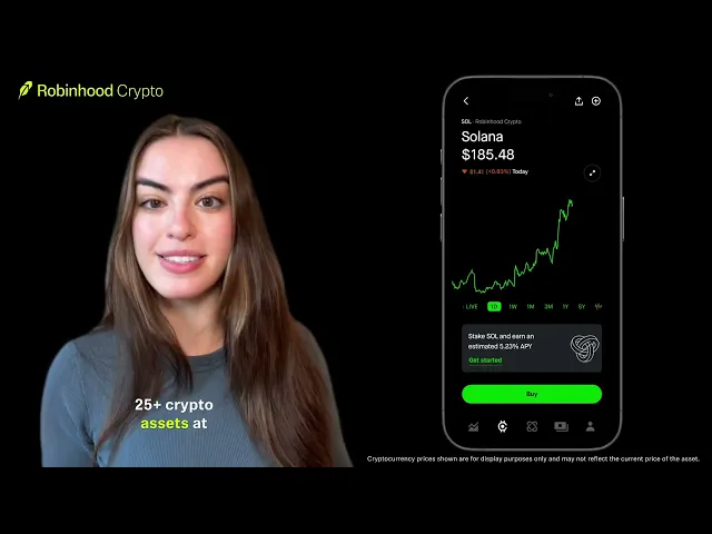
What interests me about this first ad is how it’s pitching across security, selection, and cost, which becomes more interesting when you put this next to the versions that bet almost everything on one benefit. In this case, packing the six seconds with as many elements and visuals of different sales propositions seems to be the actual strategy. You don’t necessarily have to absorb all of it to leave with a reason to consider the product.
#2
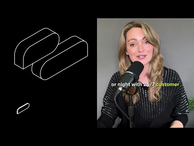
The pitch in this example of “24/7 customer support” is our first example on this list of a focused and concentrated CTA. Asking the audience to think beyond the initial signup and hit a concern for crypto traders who have experienced more than one exchange going under with all their funds still in locked up. So addressing that hesitation is a must to bring even new users onto the platform who may have only heard negative stories about the space. (I want to note my own experience with their customer support has been abysmal…)
#3

The direct call of “Lowest costs” changes the job of the ad again. Robinhood doesn’t always need to explain the category or make trading feel approachable, for some people they just need to give the good ol’ wallet incentive.
#4
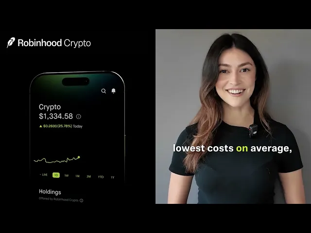
This looks close to ad 1 on paper with a female presenter, app demonstration, and similar product claims. But I think the subtle difference are what can make things even more interesting. Subtle difference like changing the side of the presenter, tone of voice, or where the subtitles are placed can all make a surprising impact when running these campaigns. For example the presenter being on the opposite side of a skip button on may keep peoples attention for a moment longer, or someone might just connect with a presenter that has more aura in their eyes. Its almost impossible to make single piece of content to please everyone, so why not get a bit granular and gather some data.
#5

So far this is our biggest departure in format, starting with a joke that doubles as an authenticity signal for someone that rejects advertising on their favorite platform all together. This more exaggerated and humorous format also creates a sort of lull into the actual sell, by subliminally creating an environment where the viewer lets their guard down seeing the presenter in a more friendly context.
#6
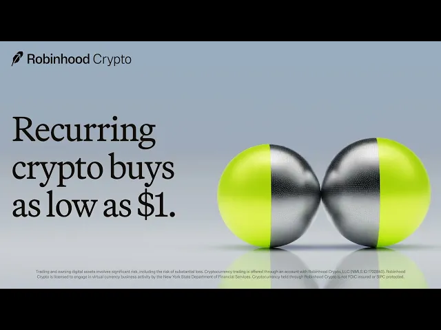
This final ad contributes to a different part of Robinhood’s brand identity. While the personable ads from before lean toward their values of making trading accessible for everyone, this ad goes toward a different brand pillar and give a more polished brand impression. The materials and minimal composition create a more designed product-advertising feel, which could also appeal to viewers who find creator endorsements less credible.
The Takeaway
From a distance these all look like minuscule changes, but I think very granular creative testing offers immense benefits to brands. And as far as lift goes, they’re only six seconds, it’s almost the perfect format to be using variations in messaging and seeing how they’re being received by different audiences.
Unfortunately we can’t see the targeting or results in the Google Ad Transparency Center, so we can’t say 100% that these clean tests or that each version is reaches a specific distinct audience. But the creative gives Robinhood a huge data advantage how small details effect their CTR.
That’s Edition 002. Thanks for reading! Small note, in the last edition with wide eyed optimism I mentioned this might be a weekly newsletter. Looks more likely to be on a monthly cadence, at least for now.
If you’d rather watch me break this stuff down than read it, I’m on TikTok and most other networks @john.sferra.
